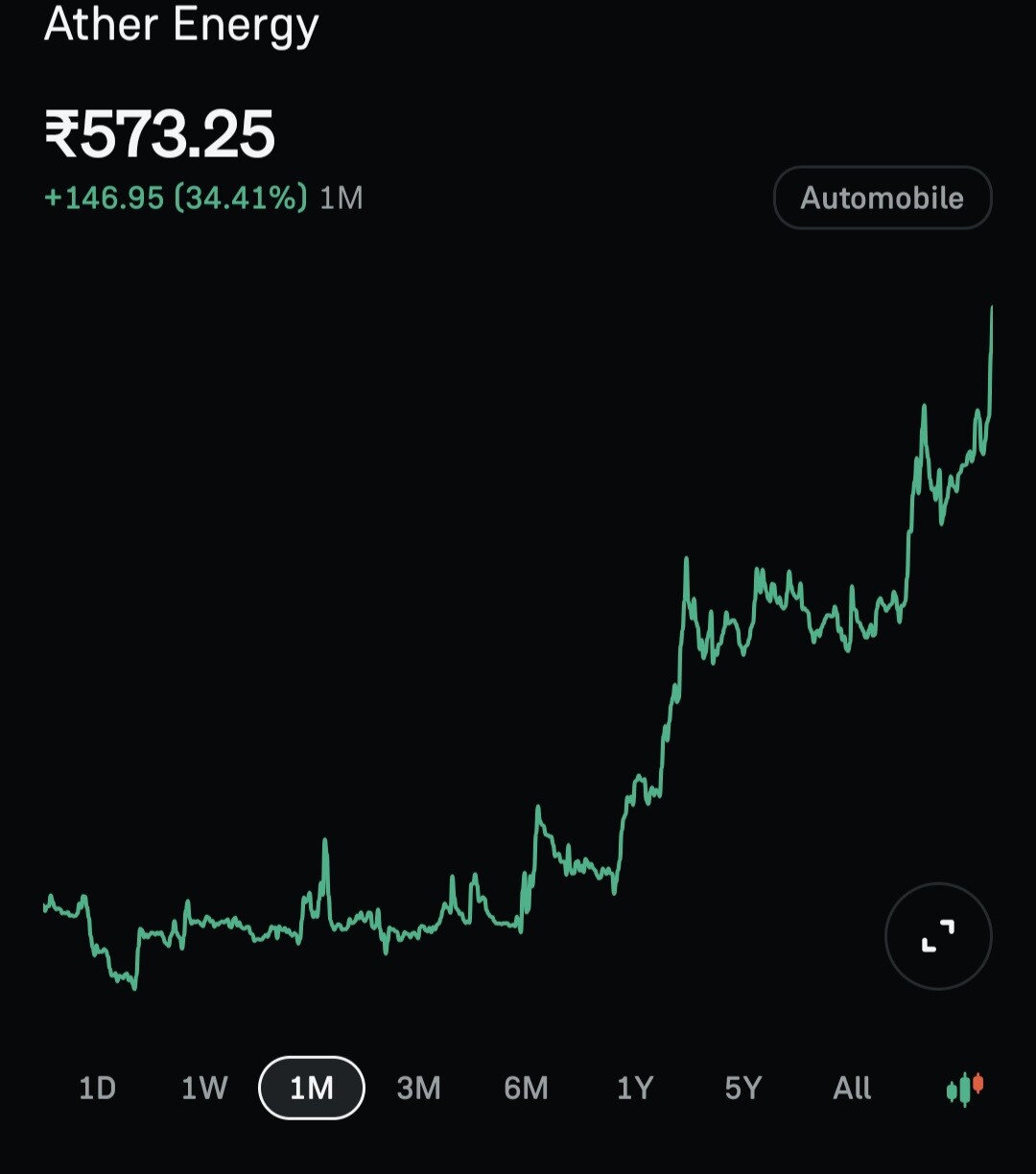
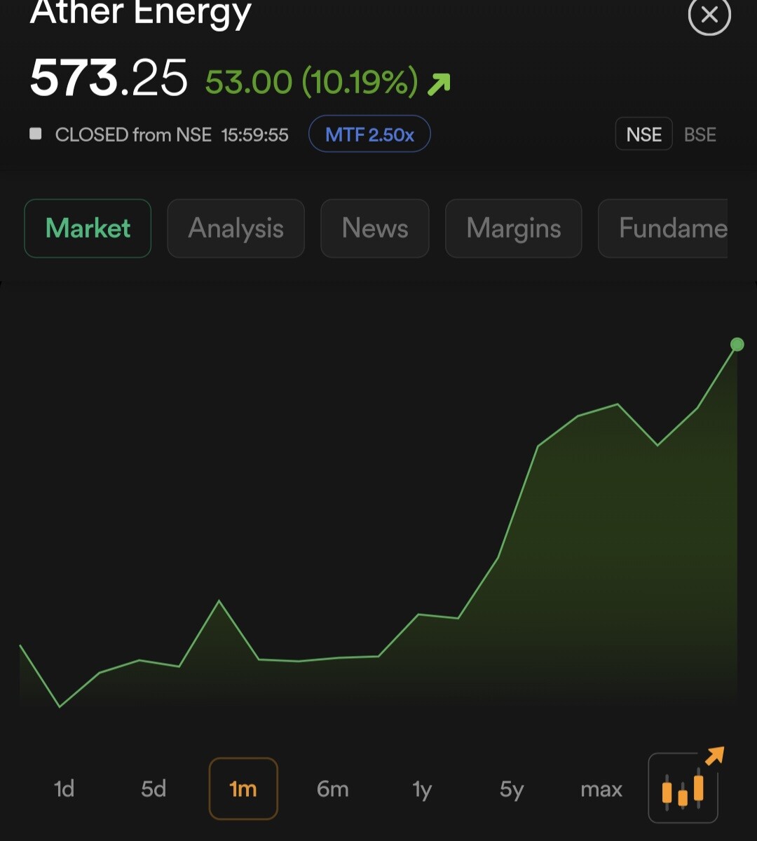
I just wanted to share a small suggestion regarding the charting experience.
Currently, the chart display and smoothness could be improved further. If you look at apps like Groww, their charting interface feels extremely smooth, informative, and user-friendly. Please don’t take this as a direct comparison — I’m only mentioning it as an example of how fluid and seamless the charting experience can be made.
If Dhan could enhance its charts to the same next level of smoothness and detail, it would really uplift the overall trading experience and make it one of the finest platforms out there.
I am also attaching screenshots of both app interfaces, just to highlight the difference clearly. My intention is not to compare, but only to share a reference that might help in improving the experience.