Hello @PravinJ
I think the sort options placement bar needs a rethink as it is placed right below the middle axis of the screen in the watchlists.
Given the watchlists card design, already fewer stocks fit in the screen and on top of that, a big gaint bar is right in the middle.
I’d appreciate if this could be removed from the middle of the screen to the bottom or top or maybe something better can be done here.
Thanks.
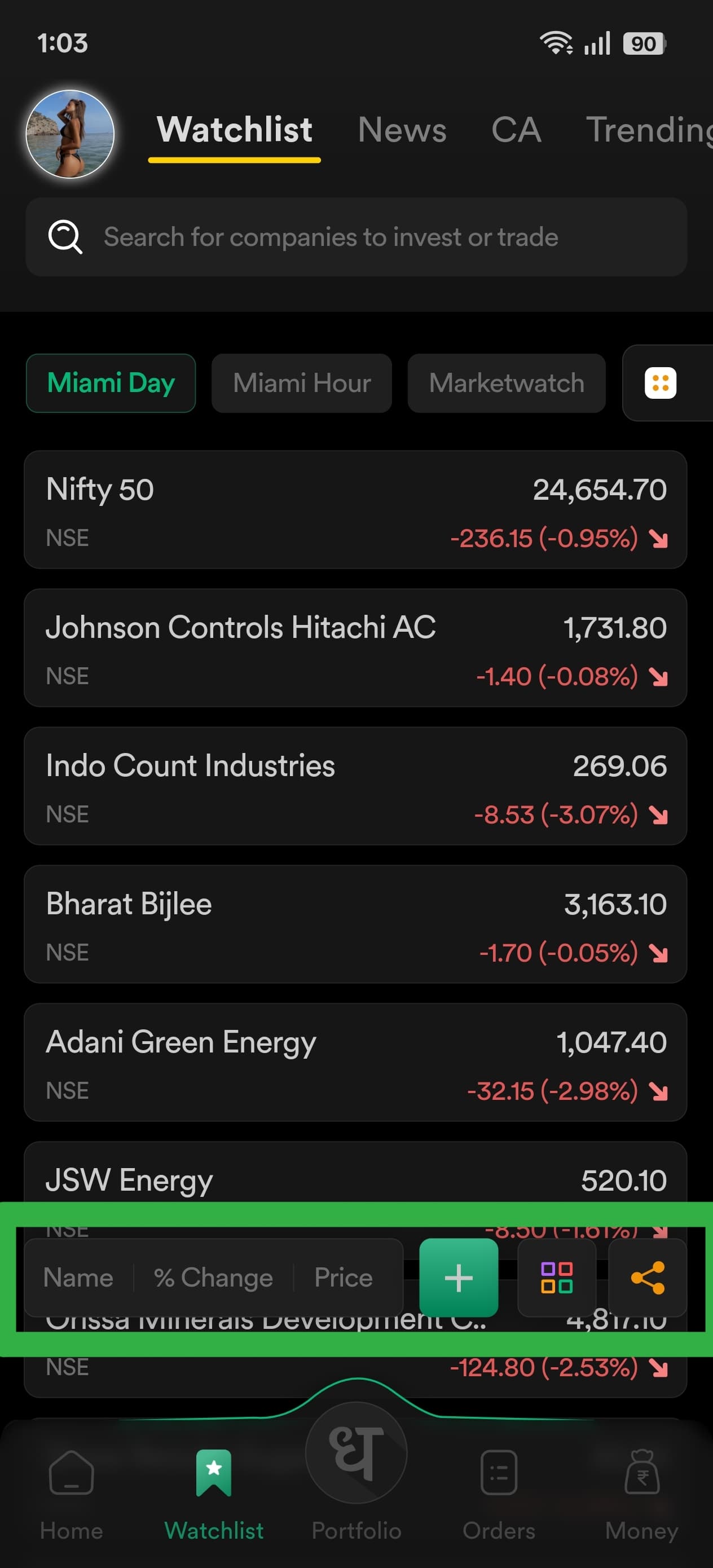
For reference only 6 stocks, can properly fit in the mobile screen or maybe 7 at the most, versus 11 of Angel One without any clutter and visually blocking elements.